
Landing Pages are one of the most difficult aspects of PPC Advertising. Not only is it challenging to create high-quality landing pages, but it also takes time to test which designs are converting well. If you are an advertiser that is managing several accounts or a large account, you may simply lack the time or resources to optimize each and every landing page.
Below, you will find a video and a corresponding article that will give you some landing page best practices, tips, and tricks. The best tip I can give you is to take the time to create multiple landing pages for your advertisements so you can optimize your conversion rate.
Landing Page Best Practices Video
Landing Pages Best Practices Checklist
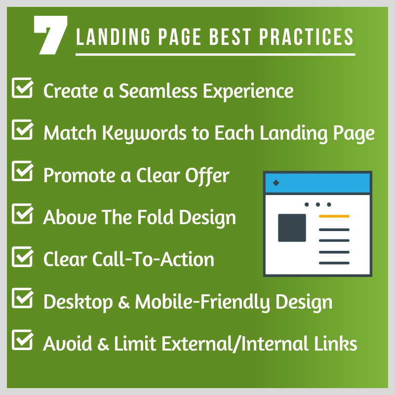
7 Best Practices When Creating Landing Pages
There are plenty of tips when it comes to improving your conversion rate and your cost per conversion. One major focus area should be your landing pages. The best practices below are a great place to get started.
1. Create a Seamless Experience
A seamless experience means your advertisement and your promotion match your landing page.
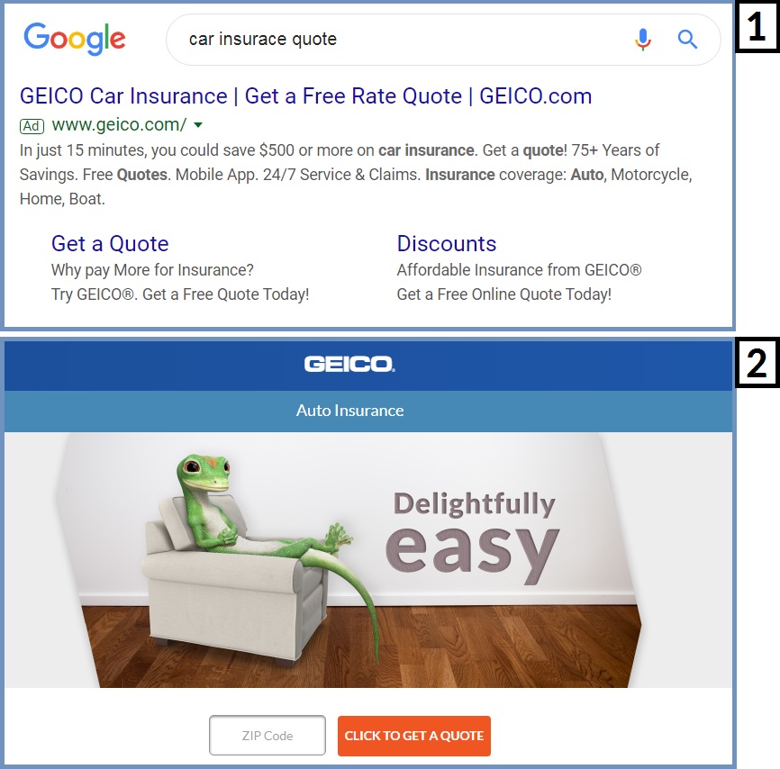
If you see an advertisement for a 20% off sale using a specific coupon code, that promotion and that coupon code should be shown and explained clearly on your landing page. For another example, if I’m looking for a car insurance quote, the landing page I click on should allow me to find a quote as easy as possible.
Take a look at the example below from Geico. When I searched for a Car Insurance quote and clicked on their advertisement, all I need to do is enter my zip code and I can get started with finding a quote with ease.
2. Match Keywords to Each Landing Page
There are plenty of reasons to match the keywords you are targeting with the keywords on your landing page. For one, it goes along with the first best practice of creating a seamless experience.
More importantly, when it comes to Google Ads and Microsoft Advertising, it will help your quality score in terms of Ad Relevance and Landing Page Experience.
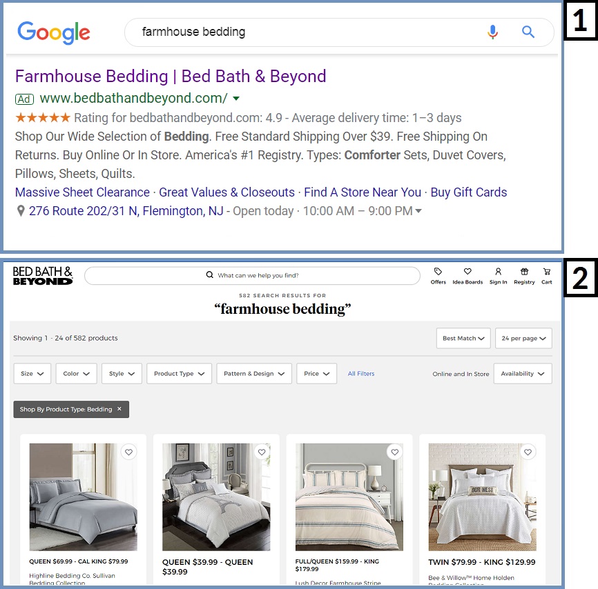
Take a look at the example below from Bed Bath & Beyond. For a search looking for ‘Farmhouse Bedding’ the landing page matches with the same keyword text and relevant bedding sets.
Last but not least, the words and phrases you utilize in your advertisements should also match on your landing page as well. Even if you are using Interest Targeting, you should still want the keywords on your landing pages to match the interests you are targeting.
3. Promote a Clear Offer
One thing that may hinder your conversion rate is a confusing offer or a promotion on your website that does not match your advertisement. If you are promoting a piece of software for $30/month in an advertisement, and your website price says $40/month, people are going to be confused when they visit your landing page.
Take a look at the example below from T-Mobile. They are offering very specific offers on iPhone 11’s in their Display Advertisement, and that offer is clearly displayed on their landing page.

If you are promoting a free trial, a one-time discount, or new customer promotions, it should be as clear as possible. When I click an advertisement, I want to know that I can quickly and easily take advantage of the offer on the advertisement.
4. Forms and Call-To-Action Above The Fold
Above The Fold refers to the part of the webpage that shows when a user does not scroll down to view more. When you open a website, you will generally see a logo, a top menu, and some images or headlines above the fold of the page.
Every important piece of your landing page should be at the very top of the page. Important forms, promotions, benefits of your products or services, videos, and vital information should be above the fold. At the very least, your promotion should show above the fold of the page.
Take a look at the example below from Best Buy. When I searched for Black Friday Laptop Deals, I could quickly and easily find relevant deals above the fold on their landing page.

5. Clear and Obvious Call-To-Action
A call-to-action is the action that you want a new customer to take. For example, for a car insurance quote landing page, your call-to-action would be something like ‘Get Quote.’ For a travel website, you may do something like ‘Book Today’ or ‘Plan Your Trip.’ Lastly, a SaaS company may offer a free trial and use a call to action like ‘Get Started Free.’
Take a look at the example below from ContentCal. They are offering a free trial and all you need to do is enter your email address to get started for free.

6. Desktop & Mobile-Friendly Design
People are going to visit your landing page from a desktop device, mobile device, tablet, and any device they may use as they browse the internet. It is your job to make your landing page mobile-friendly.
7. Limit Internal and External Links
You don’t want people to click on links that take them off your landing page because it will hurt your conversion rate. Make sure that you limit the amount of external links people can click on your website.
In Summary
The design of your landing pages does not have to be complicated. In fact, keeping your design simple and focusing on the offer, the benefits to the end consumer, and your call-to-action can help the conversion rate of your paid advertising campaigns.
With advertising platforms like Google Ads, Facebook Ads, YouTube Advertising, and others, you should create multiple landing pages for your advertisements. These advertising channels will automatically serve the pages that drive you conversions at the lowest cost.
If you have any questions about landing pages, please leave them in the comments below.
